Evolving the Rewards Tab at PrizePicks

Carter Tussi, Georgia Tech - SWE Intern
A promotion being available does not always mean it is ready to use. Some require a member to opt in first. Others have already been opted into or are available without that extra step. On the original PrizePicks Promotions tab, those distinctions were presented within a growing stack of cards.
As more promotions appeared, the page got longer and referrals and Missions moved farther down. Members had to work through the content to understand what they had, what needed action, and what was expiring soon.
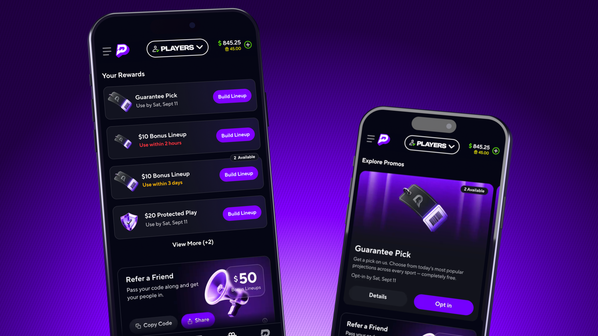
The Rewards redesign gave that content a clearer hierarchy. We separated promotions members could explore from rewards they could already use, introduced different card formats for those states, and then refined the interaction between them.
As an intern, I expected to start with some basic tasks. Instead, I was given responsibility for implementing the entire promotions page redesign, one of the major journey points for members on PrizePicks. I took it on as my summer engineering project. The goal stayed consistent throughout development, but the implementation involved more than creating new components. We had to connect those components to existing promotion behavior, account for different combinations of content, and make the transition from available promotion to usable reward clear.
Give each promotion state a place
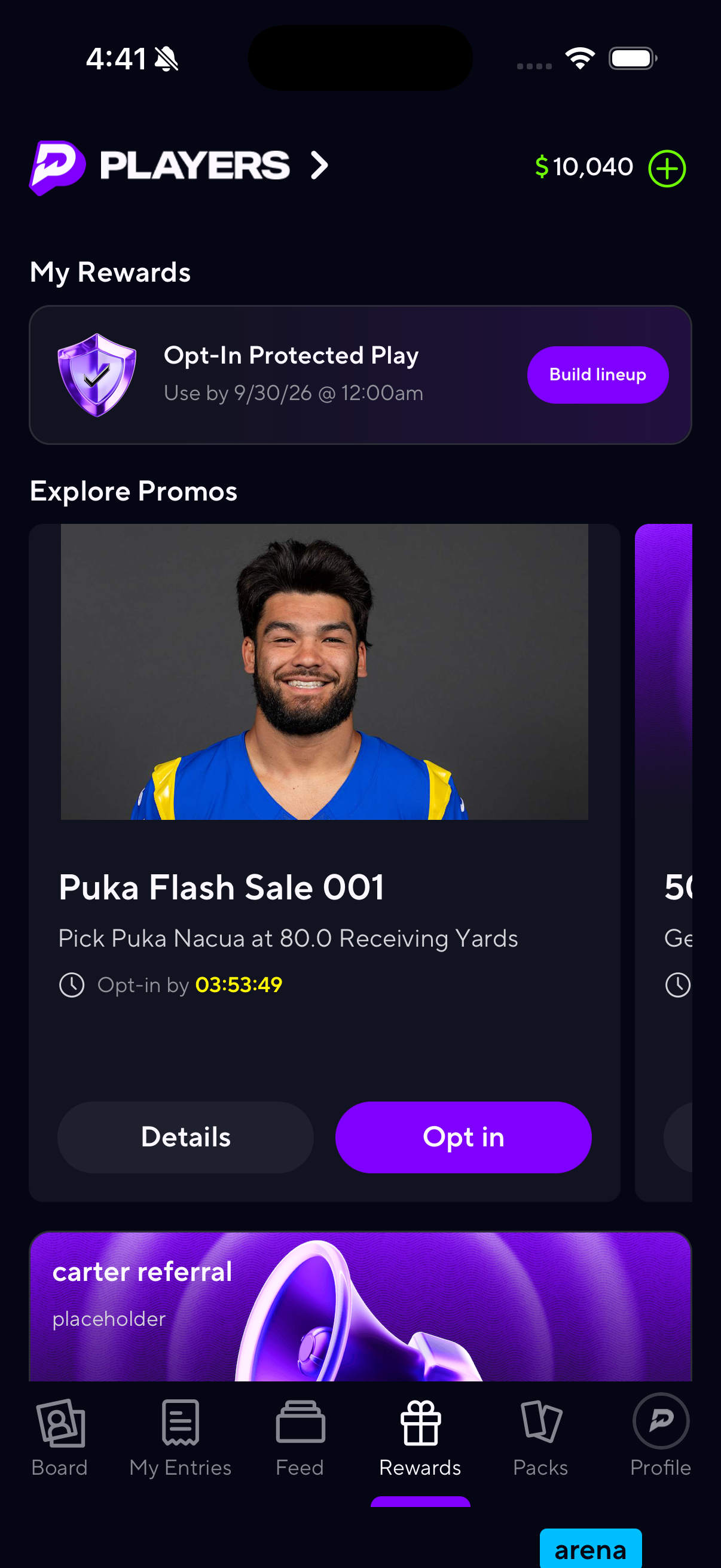
The new page separated content into Your Rewards, later renamed My Rewards, Explore Promos, referrals, and Missions.
My Rewards held rewards that were already opted into or automatically ready to use. Explore Promos held promotions that still required opt-in. That distinction also determined how we presented each item.
A promotion someone was still considering used a full-size card with more information. A reward that was ready to use appeared as a smaller, compact card with a direct action. Explore Promos used a horizontal carousel, while the rewards list could collapse after three cards. Additional promotions no longer had to add another full-size card to the vertical page.
Before implementation, I investigated the existing code and wrote a technical document from the product requirements document (PRD). That meant tracing how the screen received promotion data, how cards handled actions, and where referral and Mission behavior lived. The investigation helped us identify which parts needed a new structure and which existing behavior we could reuse before breaking the work into tickets.
Legacy Promotion Tab
New Rewards Tab
Build the visuals and validate the behavior separately
The compact reward card illustrates two different parts of the work. It needed to match the compact design, and it needed to represent the right promotion state.
Storybook, a tool for building and previewing UI components in isolation, let me work on the first part with mocked data. I could compare the component against Figma and adjust its appearance without needing a particular promotion to exist in the member app.
Then I could connect it to the page’s business logic. Opted-in promotions and rewards that did not require opt-in belonged in My Rewards. Promotions that still needed opt-in belonged in Explore Promos and used the larger cards. Existing promotion logic in the app gave us a starting point for preserving actions while changing the presentation.
This was my first time developing components with that separation. In personal projects, I generally built the visuals and behavior together. Here, I could check the card’s appearance independently, then validate whether real promotion data produced the correct card in the correct section.
Bringing the page together also meant handling accounts that did not resemble the fully populated design. A member might have Missions but no promotions, a referral offer without other content, or rewards without anything available to explore. Empty and error states needed to fit into that structure as well.
A component looking correct in isolation was one part of the work. The integrated page still had to make sense with the content an actual member had.
Use review to work through real content
Development followed a repeated cycle: pick up a ticket, build it, share questions or visuals in the project channel, and bring the work through QA and frontend review.
Sharing progress before a ticket was finished helped resolve questions while the implementation was still taking shape. QA checked visual behavior and potential regressions in the member app, while frontend reviewers helped assess the implementation.
Variable content exposed details that needed adjustment. Longer titles could make promo cards grow. Reviews also surfaced varying referral card heights and cropped bottom-sheet images. We worked through text limits and image requirements so the layout could accommodate different content more consistently.
As the MVP approached completion, Joe Ekiert, a senior frontend engineer on the team, became a consistent collaborator, including on referral and Missions work. He could pick up outstanding tickets while I focused on larger pieces. That shared project context made it easier to divide work and get specific help without having to explain the whole feature each time.
We introduced the redesigned screen behind an experiment in Statsig, our experimentation platform, with separate legacy and redesigned implementations. That let us control access to the new experience while developing and validating it.
The MVP established the new page structure and working interactions. Animations, time badge logic, and sorting revisions moved into a follow-on phase. The next part of the project focused on making changes within that structure easier to follow.
Make the opt-in transition visible
Opt-in connected the page’s two promotion sections. A promotion began in Explore Promos. After a successful opt-in, it belonged in My Rewards as a compact card.
The transition needed to show what had happened. The full-size card faded out of the carousel, and the remaining cards reflowed into its place. The new compact card entered My Rewards with a slide and fade, followed by a border sweep to draw attention to its arrival.
Although members would see one sequence, I worked on it as several smaller animations: the exit, the reflow, the entry, and the border sweep.
Storybook was especially useful for this work. I could mock and replay the visual pieces, adjust their timing, and work out how they fit together without repeatedly creating promotions in our internal admin tools and performing opt-ins in the member app. Keyframes in Reanimated, a React Native animation library, gave me a way to define custom animations and develop a consistent approach across the pieces that used them.
That separation made iteration much easier. The visuals could be refined independently before the sequence was connected to the real opt-in flow.
Successful Opt-In Animation
Tie visual confirmation to a successful request
The hardest part of integrating the animation was deciding when it should run relative to the opt-in response.
My original approach started fading the card out as soon as the member tapped Opt In. If the request failed, a return animation would bring it back. That meant coordinating both the successful sequence and a recovery sequence.
I had been meeting regularly with Product to show progress. Before opening a PR for the completed animation sequence in the member app, I raised the failure behavior because we had not fully aligned on it.
We agreed to run the transition after the opt-in call succeeded. If it failed, the member would receive an error toast without the successful transition running.
That decision removed the need for a separate set of return animations and tied the visual confirmation to the outcome of the request. It also resolved a behavior question that refining the animation in isolation could not answer. We needed alignment on what the member should see before treating the sequence as complete.
The later phase also included sorting and time badge refinements. Those addressed related questions: where a reward should appear and how the page should communicate an approaching deadline. Together with the transition work, they refined how the new structure communicated promotion state.
What the project changed about my process
The redesign reached 100% rollout in October, with the time badge update following later that month. The work had progressed from restructuring a page to refining how members followed an action across its sections.
For me, it introduced parts of the development process that were new and made familiar parts more deliberate. Planning meant drawing out the flow, identifying the core logic and possible tests, and finding behavior questions that needed alignment. Storybook provided a place to work through visuals without depending on live promotion setup. Integration, testing, review, and QA checked how those pieces worked together in the member app.
The order could change with the ticket. Animation work benefited from starting with mocked visuals. Other work could start with the promotion logic. Being able to work on those pieces separately, then validate them together, became a useful part of the process.
The overall goal stayed the same: make rewards clearer and easier to use. Getting there meant working through the details of real content, different account states, and successful and failed requests, with regular feedback from the people building and reviewing the experience alongside me.
Carter Tussi is one of our talented SWE Interns at PrizePicks.
If you're a free agent looking to get drafted to our next intern cohort, explore open roles below.